Cultured Pearl
Interior designer Tony Ingrao, his colleague Randy Kemper, and architects Francis Fleetwood unite two great American design traditions in a house on Long Island Sound
There may be no arguing about taste, but that had never stopped anyone from doing it. Interior design and architecture have many competing aesthetic camps. Some love texture and ornament; others insist on clean lines and surfaces. One party favours warm, intimate rooms; another demands bright, airy spaces. There are those who look abroad for historical influences and those who prefer all-American design references. The various groups usually find little common ground. So it is refreshing, in a day when any sort of comity is scarce, to see several bickering aesthetic viewpoints reconciled subtly and successfully in a house on the north shore of Long Island, New York.
The owners are a professional couple – he’s an investment manager, she’s a former attorney – who have five young children. When, a few years ago, they began to outgrow the contemporary open-plan house they had lived in for a decade, the two stared searching for a property on which to construct a new house. They found a wonderful site sweeping with frontage on Long Island South that was once part of a Vanderbilt family estate, (It even included the old Vanderbilt garage.) The question then became what sort of place they would build. She was for the antique look. “When you’ve lived in a modern house for ten years,” she explains, “you hunger for something with texture and tradition.” But he “loved the openness” of contemporary design and worried that an old-fashioned house would feel dark and confining.
For the exterior, the couple turned to Hamptons-based architect Francis Fleetwood, who weighed their concerns and desires and devised a residence in what might be called Shingle Lite style. Popularized by Charles Follen McKim and Stanford White in the late nineteenth-century, the Shingle style was inspired by the homely, shingle-clad structures of the Colonial era. “It’s our first truly American architecture,” Fleetwood says, The low-slung rooflines, punctuated by gables, turrets, and porches “give people a sense of place and roots.” The sturdy construction materials – in the case of the Long Island house, a Connecticut fieldstone base, red cedar shingles, and a slate roof – “speak of permanence,” he says. “The only thing that dates the house is the size and the number of the windows.”
While McKim kept his Shingle mansions cool and dim with limited fenestration, Fleetwood’s clients wanted an atmosphere as airy and bright as that of their modern house. The architect provided high ceilings and large windows, as well as bays and second-floor porches, that allow sunlight and offer splendid water views. “The Shingle style is very flexible,” Fleetwood says. “Because these houses are asymmetrical, you can have fun with the design.”
The interior is, if anything, an even more impressive design allot. The owners worked with Tony Ingrao and colleague Randy Kemper, two New York-based decorator-designers known for their innovative take on traditional decos.
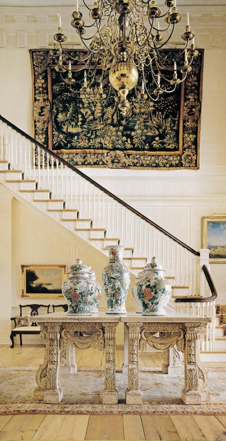
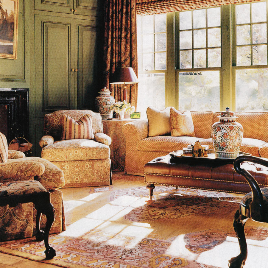
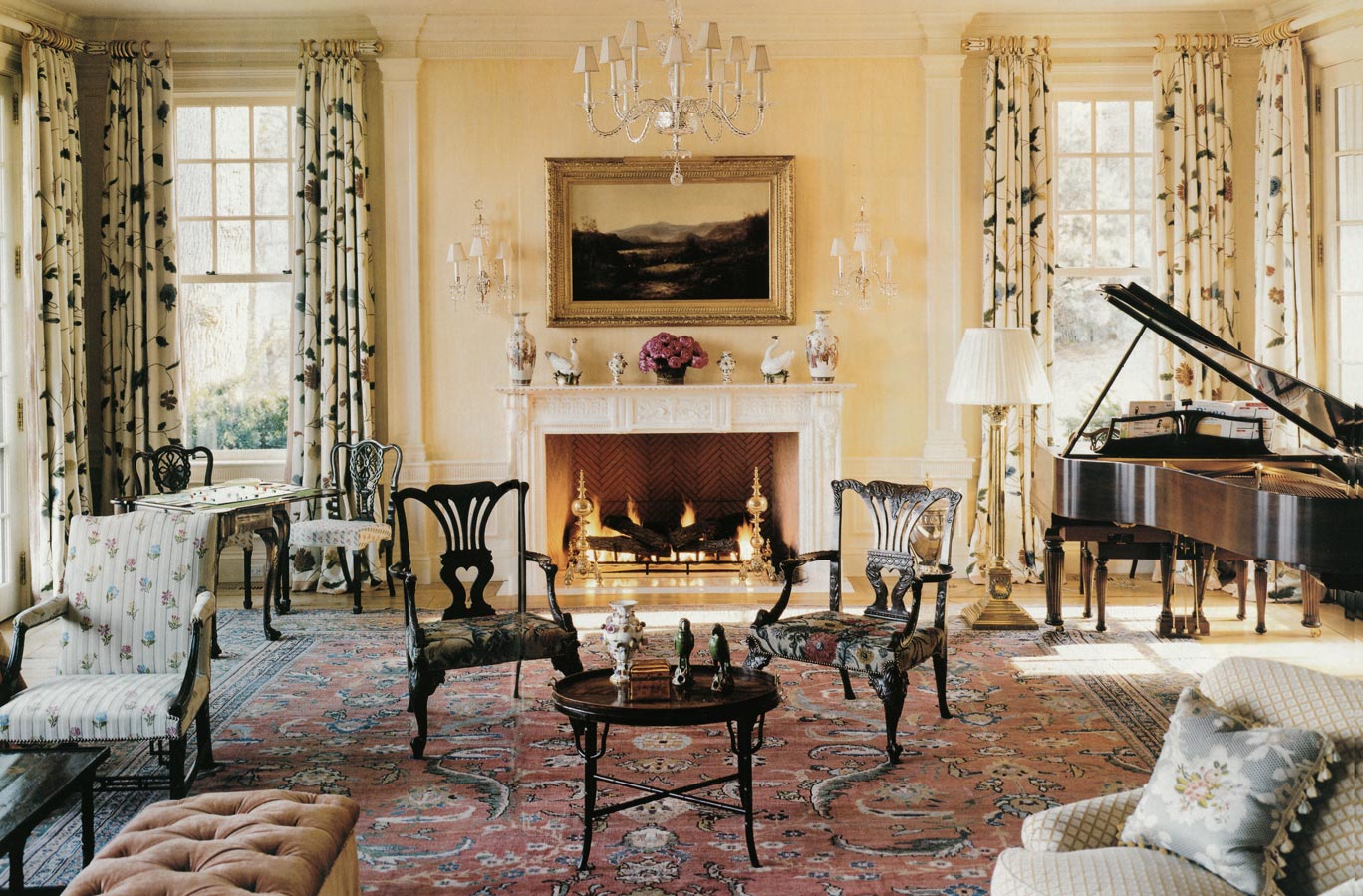
“The clients wanted elegance, but a low-key elegance,” Kemper says. “Many people buy huge houses and never go in some of the rooms. These clients live in every inch of their house.” Almost every space offers an example of tempered grandeur. The lofty entrance hall contains a dramatic stairway (Ingrao modelled it on one in an eighteenth-century house in Charleston) and is highlighted by an enormous brass William IV chandelier with 28 arms. But English Oak flooring softens the monumentality of the space. (Old-world oak has a richer, denser grain, Ingrao explains. Polishers from France were brought in to give the boards a deeply layered finish.) “When you have high ceilings, you want something that pulls them down,” one owner says. “Marble doesn’t do that.” There’s a similar effect in the living room, a huge space anchored by a staggering 36-by-18-foot Persian carpet. Taken outdoors, the rug might cover half a tennis court. But in situ, the claret carpet somehow brings the room to a human scale. Light-toned paint and floral upholstery, in colors suggested by the secondary hues in the rug, balance the decor perfectly.
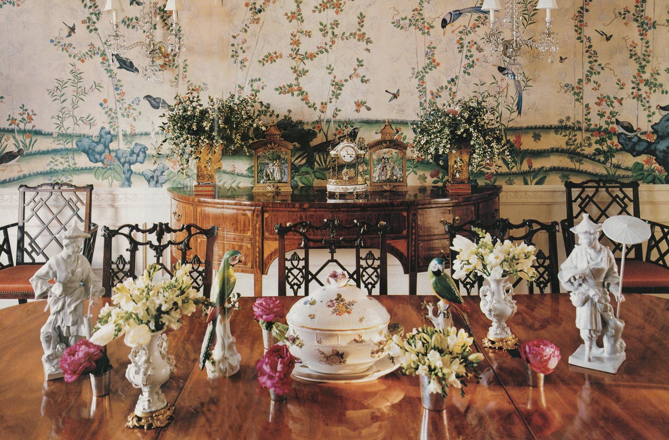
The dining room is the one unabashedly luxe space in the house. Is is furnished in chinoiserie, the eighteenth-century emblem of the worldly and exotic – Chinese Chippendale chairs, export porcelain and Meissen figurines, and, impressively, genuine Georgian wallpaper recovered from a London house. When dinner is served by candlelight glinting off the crystal chandelier, the pink wallpaper with its pheasant and floral print, creates “the most amazing atmosphere,” Ingrao says.
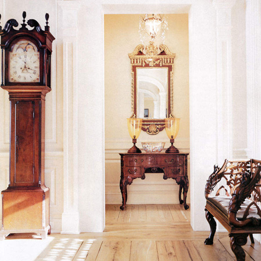
Ingrao designed the moldings and surrounds, taking a sheaf of wheat motif, for example, from an eighteenth-century Maryland house. In the entry, a Mannerist glyph that looks like a Lego block was inspired by moldings such places as the White House and Monticello. “There’s detail upon detail,” Kemper says, “but it’s so subtle it reads as simple.”
Ingrao, who last October opened his own antiques and fine art gallery in Manhattan, admits to being “a neurotic about detail.” But people, he explains, “have a greedy eye. They want to see more and more. You set up a vista, then give them something else to look at.”
These clients seem satiated. “Before we moved in, my wife promised we could move back to the old place if we weren’t comfortable,” the husband says. “But this felt like home right away. There’s no place I turn that I’m not happy.”
“The interior is about a hundred years earlier – mid to late Georgian – then the exterior. The object was to create a classic environment that hasn’t stuffy – a youthful approach to a traditional interior. We didn’t use silk, only cottons and wools, to keep to family-friendly.”
– Tony Ingrao
Written by Gregory Cerio
Photographed by Michael Mundy
Produced by Cynthia Frank
Back to Press
